Various sneakers arranged as the colors of the rainbow

The Nike Volt sneaker comes in only neon lime green. If it came in other neon colors, which would you want to wear?

SCIENCE WORLD (PHOTO ILLUSTRATION); NIKE (GREEN SNEAKER); SHUTTERSTOCK.COM (BACKGROUND)

STANDARDS

NGSS: Core Idea: PS4.B, ETS1.B, ETS1.C

CCSS: Reading Informational Text: 3.

TEKS: Science: 3.6A, 4.6A, 5.6A, 6.2E; ELA: 3.7E, 4.7E, 5.7E, 6.6E

Crafted With Color

How designers use color to create sneakers, logos, and more

As you read, think about why you might prefer an item of a certain color over others.

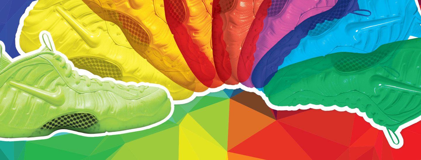
The walls of a shoe store are lined with sneakers in every color of the rainbow. They range from neon orange to deep purple to bright white. Your eyes scan the walls and land on the perfect pair. The shoes seem to say: “I’m the pair for you.”

That may not be far from the truth! Designers spend a lot of time considering how colors will connect with customers. “Colors can make us feel things,” says Deborah Hernandez. She’s a color specialist at the Fashion Institute of Technology in New York City.

To choose just the right colors for sneakers, T-shirts, logos, or anything else they’re creating, designers rely on color theory. Part art and part science, these guidelines show how colors can be combined to create appealing designs for every person and occasion.

The walls of a shoe store are lined with sneakers. They come in every color of the rainbow. The shoes range from neon orange to deep purple to bright white. You scan the walls. Your eyes land on the perfect pair. The shoes seem to say, “I’m the pair for you.”

That may not be far from the truth! Designers spend a lot of time thinking about colors. They want their products to connect with customers. “Colors can make us feel things,” says Deborah Hernandez. She’s a color specialist. She works at the Fashion Institute of Technology. It’s in New York City.

Designers want to choose the right colors for sneakers, T-shirts, logos, and more. They rely on color theory to do that. It’s a set of guidelines. They show how colors can be combined. That creates designs that appeal to every person. It’s part art and part science!

Color Decoded

The origin of color theory dates back to the 1660s. That’s when English scientist Sir Isaac Newton conducted experiments using prisms. He found that these transparent crystals refract, or bend, white light and separate it into a rainbow of hues. This range of colors is known as the visible spectrum.

Scientists later discovered that light travels in waves. They also found that each color of light has a different wavelength, or distance between wave peaks. Red light has the longest wavelength, and violet light has the shortest.

Newton placed the colors in the order they appeared in the visible spectrum—red, orange, yellow, green, blue, indigo, and violet—on a circular disc. This arrangement of colors led to the creation of the modern color wheel (see The Color Wheel). The disc has proved to be more than just a useful tool for artists to organize color. It also helps designers choose colors for ads, products, and more.

Color theory dates back to the 1660s. That’s when Sir Isaac Newton did experiments. He was an English scientist. He studied prisms. They’re clear crystals. He found that prisms refract, or bend, white light. The crystals separate the light into a rainbow of hues. This range of colors is known as the visible spectrum.

Scientists later found that light travels in waves. They also found that each color of light has a different wavelength. That’s the distance between wave peaks. Red light has the longest wavelength. Violet light has the shortest.

Colors in the visible spectrum appear in a particular order. It’s red, orange, yellow, green, blue, indigo, and violet. Newton placed the colors in that order on a circular disc. This led to the creation of the modern color wheel (see The Color Wheel). The disc has proved to be a useful tool for artists. It also helps designers choose colors for ads, products, and more.

More Than a Feeling

Designers use the color wheel to see how colors relate to one another. That helps them pair colors together. The colors across from each other are called complementary colors. These colors contrast with one another. When paired together, complementary colors stand out.

The color wheel shows people how colors relate to one another. It also shows how they can be paired. Take colors across from one another on the wheel. They’re called complementary colors. When paired together, these colors stand out.

WESTEND61/GETTY IMAGES (LEFT CHILD); ISTOCKPHOTO/GETTY IMAGES (RIGHT CHILD)

You can use colors to express yourself with clothes. What color combos do you like to wear?

Analogous colors are next to each other on the color wheel. Using these colors together often make people think of nature. For instance, red, yellow, and orange together can remind people of fall leaves. Shades of blue and green can make people think of the ocean or forest.

Colors don’t just affect what people think about. They can also affect how we feel, experts say. The color wheel’s “cool” colors, like blue, green, and violet, are believed to have a calming effect. That’s why the scrubs worn by doctors and nurses are often blue. “They can give people a sense of healing,” Hernandez says.

The other colors—shades of yellow, red, and orange—are thought to energize people and stimulate their appetite. That’s why many restaurants use them in their logos, says Hernandez.

Designers think about other factors when coming up with winning color. For instance, they may consider how people’s color preferences relate to their culture and background. In the end, most designers aim to use colors that appeal to a diverse group of people, says Hernandez. What colors appeal most to you? Have you ever wondered why?

Analogous colors lie next to each other on the color wheel. These colors together often make people think of nature. For instance, red, yellow, and orange can remind people of fall leaves. Shades of blue and green can make people think of the ocean or forest.

Colors don’t just affect what people think about. They can also affect how we feel, experts say. “Cool” colors include blue, green, and violet. They’re thought to have a calming effect. That’s why doctors and nurses often wear blue uniforms. “They can give people a sense of healing,” Hernandez says.

“Warm” colors include shades of yellow, red, and orange. They’re linked to energy. They’re also thought to fire up people’s appetites. That’s why many restaurants use them in their logos, says Hernandez.

Designers think about other things when thinking up winning color combos. They may consider how color relates to people’s culture and background. Most designers aim to use colors that appeal to a wide group of people in the end, says Hernandez. What colors appeal most to you? Have you ever wondered why?

What does your class think?

What’s your favorite color to wear?

Please enter a valid number of votes for one class to proceed.

What’s your favorite color to wear?

Please select an answer to vote.

What’s your favorite color to wear?

0%
0votes
{{result.answer}}
Total Votes: 0
Thank you for voting!
Sorry, an error occurred and your vote could not be processed. Please try again later.
videos (1)
Skills Sheets (4)
Skills Sheets (4)
Skills Sheets (4)
Skills Sheets (4)
Lesson Plan (1)
Leveled Articles (1)
Text-to-Speech